There are many different ways to create embroidered sweatshirts, which is a versatile and fashionable item that combines comfort with personal style. As the seasons change, people love these cozy clothes not only because they’re warm but also for all the bright colors on them. This article will look at some popular colors for embroidered sweatshirts and talk about what each one means. So you can choose the best colors for your custom designs! Whether it’s an old favorite or something new and trendy this year, knowing how colors affect us can help make sure our embroidery is eye-catching and resonates well with others.
Black & White – The Classic Duo
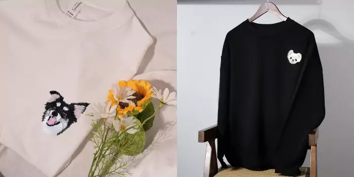
Black and white are timeless colors, Which often associated with elegance and sophistication. These sweatshirts can be dressed up or down for any occasion, because they’re so versatile. They’re great for making a statement too, since the contrast between these two hues creates such a striking visual effect that lots of people love!
Common patterns include:
Geometric shapes – Clean lines give classic combos a modern twist.
Typography – Bold letters in black or white really stand out against each other (or both!).
Abstract designs – Intricate patterns show just how many different shades there actually are within this seemingly monotone palette!
Pastel Hues – Soft & Feminine
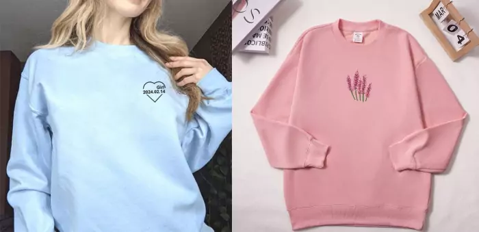
Pastels have taken over fashion lately, especially among women who enjoy more delicate looks during springtime when everything starts blooming again anyway! Blush pink has become increasingly popular as well as baby blue, mint green, lavender etc., light shades which bring peace into our lives by evoking calmness wherever we go wearing them.
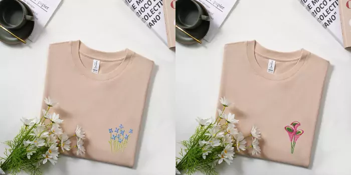
Floral embroidery is often seen on pastel-colored pieces, since it adds some natural beauty to otherwise plain garments which might need that little extra touch of interest! However, even abstracts done using softer tones offer a fresh take on traditional techniques too.
Vibrant Brights – Make A Statement
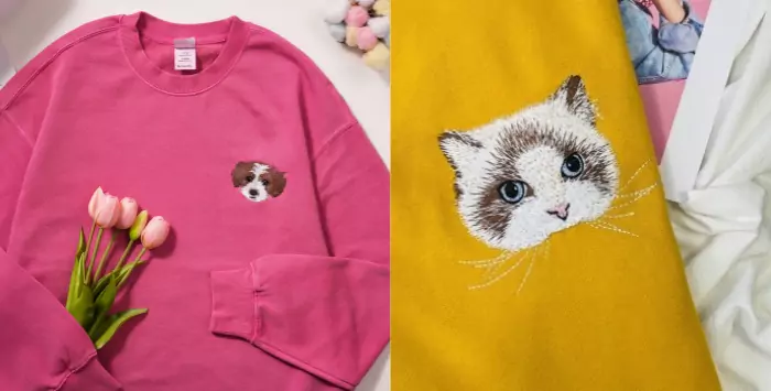
For those looking to make a statement with their embroidered Sweatshirts – bright colors are hard to beat! Red, yellow and blue can really liven up any outfit, bringing energy into even the dullest of days.
When going for vibrant hues, it’s important not just what is embroidered but how. Eye-catching Pattern will always work best when paired alongside bold shades. As otherwise, things might end up looking slightly too blah or washed out (unless that’s what you’re going for)!
Earth Tones – Natural & Versatile
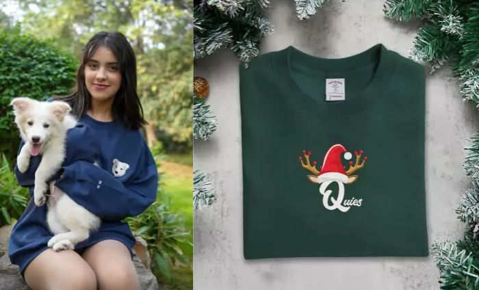
Earthy color palettes are gaining popularity in many areas these days – including embroidery. The reason why this look works so well on sweatshirts is because they give off an easy-going vibe while still being stylish at the same time. Olive green has been huge recently, along with terracotta and mustard yellows which all bring warmth to any item dyed using them.
Nature-themed designs often feature heavily within earth tone ranges too. Such as leaves / flowers etc., therefore making sure your chosen design reflects accordingly. Ensure everything ends up matching nicely together creating a seamless finish overall!
Metallic Shades – Glamorous & Edgy
If you want something really different from traditional patterns, then metallic threads could be just what the doctor ordered!
How Businesses Choose the Right Colors for Custom Embroidery
There are some things a person should know when it comes to selecting the color scheme for his or her custom embroidery business.
1. Keep in mind your target audience and brand identity
Different people have different preferences about colors, depending on their age, gender and culture. Among other factors what may look good in one place might not be so elsewhere. Therefore, it is important to consider this while making your decision. It’s also key that whatever colors you choose they should match with what you want to communicate through your brand.
2. Practical Tips for Choosing Complementary Colors
These are few tips which can help ensure that all colors used in creating embroideries blend together well:
- Create a color palette: start by selecting few main shades which complement each other best – these will serve as foundation stones upon which each design shall be built.
- Study color theory: familiarize yourself with basic principles, like using opposite hues (complements), closely related tones (analogous) or same hue but different levels of saturation (monochromatic). Such techniques make combinations appear harmonious.
- Think about psychology behind them: various colors evoke different emotions and have varied associations. Try finding out what feelings do certain ones bring forth, then select those that align most closely with desired message or mood expressed by particular design.
3. Balancing Trendiness And Personal Preferences
While designers need to remain true themselves as individuals during creation process of any artwork, it’s still important not forget about current market fashions. Because doing so could lead into making products which won’t sell thus losing potential clients. Therefore, one should stay updated on fashion trends, especially if they deal with embroidered sweatshirts. These tend change frequently over time, but this doesn’t mean copying blindly without adding own unique touch. Rather strike balance between personal style preference and what is liked by many people.
Keeping Up with Seasonal Color Trends
Spring
During spring season, light shades such as pastel hues(refer to first part of article:Pastel Hues)are commonly used for embroidered sweatshirts. Because they represent new beginning or rebirth after cold winter months when everything seems lifeless. Additionally, pastels reflect blooming flowers around us during this time so it’s no wonder why people prefer them.
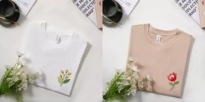
Flowers are another thing which reminds one about spring. Since most designs done at that period have floral patterns among other things like birds singing etcetera. A good example can be seen by using delicate types of blossoms like cherry blossom, daisy, tulip etcetera embellished with soft colors. These kinds of patterns capture the essence of spring, making them great for creating attractive embroidered sweat shirts.
Summer
In summer, people want to see bright colors which remind them of sunshine and beach. Thus making vibrant tropical shades popular in fashion industry too. Therefore, if you want your embroidery design to look lively, think about using bold energetic colors like sunny yellow, coral orange, bright turquoise and hot pink etcetera. These will definitely bring out the spirit of summer season accompanied by playful touch.
When it comes to beach theme, many things can come into mind. Such as waves, palm trees, seashells or even fruit designs, like pineapple /watermelon. Among others decorated with energetic colors create fun look that suits well for summer season.
Fall
As nature changes its appearance during autumn, so does our choice towards warm tone background. Rich earthy ones become dominant. Especially in fall collections where deep reds browns greens oranges are widely used together with some mustard yellow burnt orange olive green shades. These make excellent combinations when incorporated into an embroidered sweater pattern. Since they blend perfectly with cozy atmosphere brought about by Halloween festivities.
Fall themes usually revolve around leaves, acorns, pumpkins and other elements signifying warmth comfort during cold days. But one can also add few bats or witches for more fun.
Winter
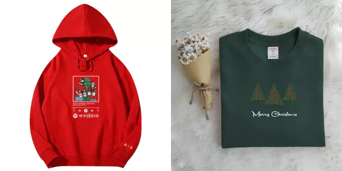
To make a winter sweatshirt design cozy, we want to use dark shades which will also bring out warm feelings in people. We can choose from navy blues, maroon reds, grass-as-grey-as-soot and forest greens when thinking about what colors to embroider on our sweats this season. Such colors give an air of sophistication and elegance that is perfect for cold weather.
During this time of year, holiday themed designs are always popular among customers. So don’t be afraid to give them what they want! Snowflakes, reindeer, Christmas trees or even just snowy landscapes, can all make beautiful embroidery designs. Especially if you use metallic thread, such as gold or silver, which adds some sparkle into these winter wonderlands too.
Conclusion
The choice of color plays a significant role in the success of embroidered sweatshirt designs. By selecting the right colors, you can create visually appealing and on-trend custom embroidery collections.

